My micros are short-form posts. They usually follow PESOS. You can expect social media style notes, and occasionally poetry, lyrics, and short commentaries.
ASMR has long been a go-to of mine when I’m having difficulty sleeping or am in need of relaxation. There is a bit of stigma surrounding ASMR due to its perceived cringeness and the inherent intimacy, but I honestly think most people would find a genre they enjoy if they were to try it.
I’m personally not a huge fan of mouth sounds, mukbangs, or similar and have a preference against roleplays but greatly enjoy deep in-ear sounds, brushing of the microphone, tapping, crinkling of objects, and other assorted sounds. If none of that is your style, there exist less conventional genres like horror or whatever the hell Emma’s Myspace is doing.
Over the past few years there have been marked improvements in the quality of ASMR content online. Many creators who started off in their bedrooms have now gotten the art down to an exact science – some have even established full professional studios. Some modern ASMR is recorded on equipment that costs more than most cars and is mastered to a standard rivalling music production studios. With zero background noise and extremely high-quality audio, it is amazing to hear with some quality audio equipment.
The creativity of some ‘ASMRtists’ is impressive – aluminium foil, misting bottles, and fizzing tablets to simulate rainstorms, or small assorted objects that one would never think would produce lovely sounds used for triggers. There are few greater ways to reduce stress and calm down than to enjoy human creativity and high-quality audio experiences tailor-made for the purpose. Jojo’s ASMR’s The Perfect ASMR Video is a great place to start.
My browser watching on in abject horror as I go to load the one-page version of the HTML spec to ‘quickly’ check something.
Every time I work away from the web I’m reminded how much I hate waiting for things to compile whenever I want to test anything.
xkcd 303 doesn’t hit quite the same when you’re working for yourself.
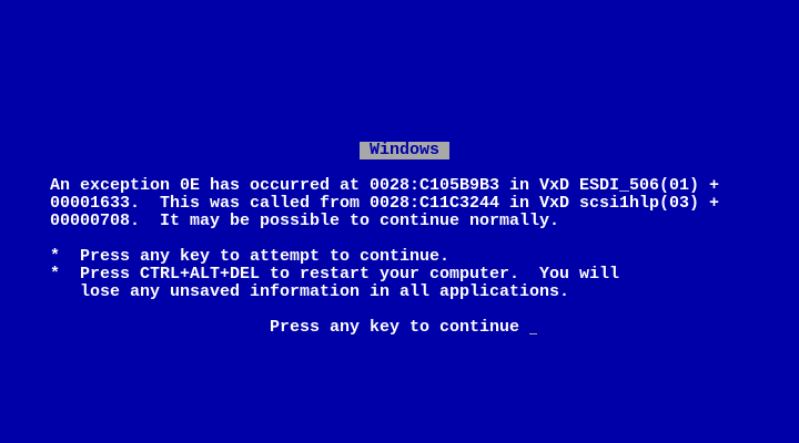
I’ve never seen this error before, but I think it is trying to tell me that something went wrong.
Always lovely when installation and configuration instructions are stored in a nicely formatted Microsoft Write (.wri) file rather than just plain text.
Also shout out to Mosaic for the lovely install instructions.
Just tried to type ‘Java’ several times and each time my fingers autocompleted it and managed to type ‘JavaScr’ before I could stop them
If <img> wasn’t a void element and alt text was provided as content rather than as an attribute, I think more people would write alt text.
Perhaps the path to human-level AI being taken by AI companies is not to make more capable AI, but to drag humans down to the level of AI.
Another year, another Interop. Interop is a collaborative effort by organisations that implement web technology in browsers to identify what should be prioritised. Firefox has created ‘2027 Web Platform Feature Ranking’ for ranking the 2027 Interop proposals.
As is my civic duty, I’ve submitted my rankings. I’ve reproduced them here with comment. Truth be told, I’m interested in almost all of these proposals, but I’ve only ranked the ones I’m most interested in. If everything is highlighted, nothing is highlighted.
Targeted SVG improvements. My love for SVG filters is unhealthy, unhinged, and bordering on perverse. I want the bugs fixed and support for various capabilities improved.
CSS @supports at-rule(). Certainly valuable to lots of cases, but something that is particularly valuable to me when creating demos of new features for articles. Progressive enhancement is great in many cases, but I need to show what I’m trying to show, and a fallback will confuse. I need to be able to detect support and act on it.
CSS flex-wrap: balance. There is so much utility in being able to balance a flexbox’s items when wrapped. I’m already using it as a progressive enhancement.
CSS line-clamp property. line-clamp has been so desired by so many people for so long. I’m already using the vendor prefixed -webkit-line-clamp in many places.
Customisable/stylable <select>. Select has been reimplemented in so many hacky ways that are often especially terrible for accessibility. Native support on the web platform would be so wonderful.
Progressive rendering of JPEG XL and AVIF images. I love AVIF and especially JPEG XL, and would love preview versions of images while the rest downloads. It would be such a great usability thing for users with no added effort required.
CSS corner-shape property. I want fancy corners on my elements. They offer so many fun opportunities and are otherwise tricky to implant.
JavaScript Temporal. I don’t need Temporal to live; I just need Date to die.
CSS scroll-triggered animations. Scroll-driven animations have more utility in my opinion, and they’ll be seeing wider browser support soon, but scroll-triggered animation support would complement them nicely.
CSS gap decorations. A commonly needed/wanted but tricky to achieve effect that often needs funky border, padding, or pseudo hacks. Browser support would be great.
Responsive iframes. I’ve previously written about making iframes responsive, and it is a pain to do. I’m not actually sure the design of the system is perfect, but hopefully that can be fixed, I’d like to see this capability in browsers.
Device Posture API. I’m not yet sure that foldable devices are ‘the future’, but I think they’re positioned to become a lot more popular in the near future. The Device Posture API will allow us to do so much with them on the web and bring parity with that which can be done in native applications.
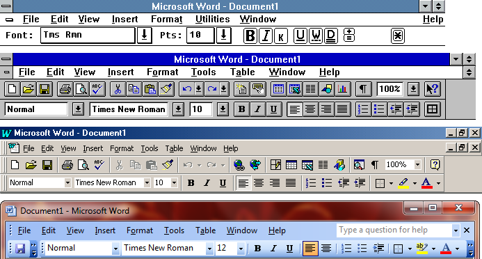
I won’t kid that the ribbon is a perfect interface, however I think it is a perfectly cromulent one for what it needs to do. The first version of Microsoft Word for Windows was released in 1989. It didn’t have a ribbon but instead toolbars. It was followed by several further versions, all keeping the same general toolbar design:
Pre-ribbon toolbars. From top to bottom: Word 1.0 on Windows 3.0, Word 6.0 on Windows 3.1, Word 97 on Windows ME, and Word 2003 on Windows 7.
In 2007, however, Microsoft overhauled Office’s design to use what they called the ‘ribbon’ – a set of tabs with toolbars harbouring buttons of various sizes, dropdown menus, selection systems, and other interactive elements grouped by relevance. We’ll ignore that they’d already been calling it the ‘ribbon’ since the earliest releases, and that ‘ribbon’ was a common term for such toolbars in user interface design dating back to the 1980s.
Ribbon menus. From top to bottom: Word 2007 and Word 2010 on Windows 7, Word 2013 on Windows 10, and Word for Microsoft 365 on Windows 11.
I know some consider it sacrilege to say so, but I think the ribbon gets a pass. The grouping of related items together in labelled sections helps with association and understanding of function, even when just an icon is shown. The ribbon also at least displays some textual labels, which is nice for usability over everything being an icon.
Being a bit taller, the ribbon also has room to significantly flatten the hierarchy by exposing items users had to go digging for in the menu bar, so feature discoverability is much improved. Contextual tabs that only appear while performing an action that necessitates them also reduce the clutter of appearing toolbars.
In the ribbon, more commonly used items are larger and exposed more readily, unlike the equal-sized and tiny, uniform buttons, which all looked the same and were needlessly difficult for a user to click with a mouse. This let the ribbon remain consistent while making frequented items prominent, solving a problem that Microsoft had been sloppily trying to fix via ‘adaptive menus’, which would hide less-frequently used menu items (while breaking spatial memory).
For a user only requiring basic functionality, everything they need is top-level, with everything else staying largely out of their way. For a more advanced user, everything is accessible and discoverable with minimal added navigation. A power user can hold down Alt for plenty of shortcuts. I much prefer this to separate ‘simple’ and ‘advanced’ modes, which ruin tutorials or giving instructions and usually overcorrect in either direction.
Office 2007 wasn’t a perfect implementation, but by Office 2010 the ribbon had been refined: some of the extraneous borders and ‘busyness’ removed, and the ability to rearrange and customise it returned. In the versions since, it has been tweaked and improved further, and programs outside of Microsoft Office have also adopted it. The ribbon is good, and there is a reason why we’re still using it some two decades on from its introduction.
‘Look, everything is ruined and I’ve died on you (again). Y’know what, though? If you press any key we’ll YOLO it. We’ll see how it goes. In fact, there is a pretty decent chance things might work again. Though you probably shouldn’t put that floppy disc in again. I think that is what cooked us.’
The doors of the vault have been blown wide open now, and everyone with pocket shrapnel is shoving it in the direction of their language model of choice in pursuit of glory. Somewhere in the past few months, emulation, decompilation, static recompilation, ports, and mods of games have exploded in numbers.
Decompilations – where compiled is returned to source code – have always been extremely complex, time-consuming efforts. There is a reason that only early games had seen decompilations until recently. Static recompilation – where compiled executables are transformed – is a slightly simpler effort, though still very difficult. Porting games between systems and modding them are further complex undertakings, varying in difficulty depending on target and scope.
Emulators, decompilations and recompilations specifically are huge feats. Some of the most impressive development feats I can think of. At least, they are under human effort. In recent months, however, the barrier has dropped substantially. In particular, there have perhaps been more recompilations in recent months than in recent years combined. It is hard to fathom the speed of development.
Other than the typical AI woes, one thing that is worrying with decompilations particularly is that there is undoubtedly leaked code in LLM training sets. What does this mean for the legality of these decompilations? They can’t reasonably be considered ‘clean room’.
As fantastic as this all is, I do worry about the repercussions. With the barrier lowered so much, how will game companies react? Will they fast-track a move to streaming-only distribution to stop binaries from being used for reverse engineering work and from people quickly running games on their own terms? I worry this will speed up the death of personal computing as companies turn it into a service.
I fear this threat outside of gaming, too. ArtCraft is an AI-generated suite cloning Adobe’s Creative Cloud. Lots of other software is seeing similar AI-generated clones or decompilations, too. This is effecting software by huge organisations with a lot of sway in a very poorly regulated climate. How are they going to act, and will users outside of the informed, technical few push back? I doubt it.
The amount of comments on recent videos by Kevin Powell saying ‘CSS is dead’, or ‘Surely Claude can just do it’, or ‘Opus could one-shot it’, or other permutations of the same thing is so disappointing.
What weirds me out most about these pro-AI comments are the people seemingly celebrating skill erosion. It seems forced, and I’m not sure what would compel someone to do so. Are they being paid by AI companies? Are they just trolls? Is this astroturfing?
There are two colour models: additive, and subtractive. Screens use additive colour, where red, green, and blue (RGB) are added to each other to create new colours. Print uses subtractive colour, where cyan, magenta, and yellow (CMY) subtract from white light.
Additive relies on light being emitted from a surface, while subtractive relies on light reflecting off a light surface (like paper), which results in it having a much smaller gamut due to limits on how much light can be reflected. Because it can’t reproduce every colour, spot colours (pre-mixed single-colour inks) such as those from Pantone are commonly used.
Additive on the left, subtractive on the right.
Note that the combinations of two colours in RGB provide CMY, and vice versa. Looking at subtractive, one can observe that:
Cyan absorbs red light (reflects green + blue).
Magenta absorbs green light (reflects red + blue).
Yellow absorbs blue light (reflects red + green).
Print actually uses CMYK, the K representing ‘Key’. Though a CMY alone can create dark colours, it isn’t optimal. The colour is often more of a dark brown than a full black, and printing with cyan, magenta, and yellow usually leads to less fine detail, leaving text fuzzy. For this reason, when printing black, there are three primary different methods used. Standard black (also called flat black or single-colour black) is just straight black ink, which is good for detail such as for text, but doesn’t quite reach pitch darkness. Rich black uses CMYK, meaning it uses those CMY colours paired with black (or ‘key’) ink to achieve a darker, more saturated black. Due to multiple layers of ink, some detail is lost, though.
Even darker is registration black, which is 100% of each cyan, magenta, yellow, and key for the darkest black possible. This does mean a lot of ink (400%) is used, however, which often leads to ink bleeding and smudging, longer drying, and warping of oversaturated paper stock. It is worth keeping in mind Total Ink Coverage (TIC) / Total Area Coverage (TAC), which is typically capped at ~240% for uncoated and ~300% for coated. For this reason, it is usually reserved for crop marks, trim lines, and such.
I attended DDD Perth for the second time today. This time, not just as an attendee, but also as a first-time speaker!
I caught a few talks, but there were two standouts of those I saw:
Matthew Pierce presented Rethinking Web: Can we do more with less? about web platform features that can be embraced in place of frameworks, abstractions, and libraries,
One of the issues with a multi-track conference is that there are too many brilliant talks going on simultaneously, and one can’t be in five places at once!
I made a point to be very outgoing and talked to so many people. A few people recognised me from my work and name, which remains an extremely surreal experience, and I got to have interesting hallway chats with such a variety of folks with different skills.
My talk was titled ‘Newly Acquired Powers of the Web Platform’, and I ran through a handful of fantastic new features of the web platform. HTML and CSS have seen so many new additions in recent years, so I ran through text-wrap: balance, flex-wrap: balance, corner-shape, text-box, sibling functions, color-mix(), contrast-color(), invoker commands, scroll-driven and scroll-triggered animations, and view transitions, while cramming mentions of a few more additions in too. Jam-packed! I’d have included more if I wasn’t already on the edge of my time limit.
I had some nerves, though they were mostly pertaining to if my laptop and custom web-based slide deck system would work fine on the AV system of the venue. Rather than replicate the output of the code I was talking about in PowerPoint or similar, it felt proper to use the web directly. Thankfully, everything ran smoothly, and I managed through the presentation without issue. I was late out at the speaker’s dinner at the venue-adjacent pub last night and early rising to get prepared and to the conference, so I only got three and a half hours in the early hours of this morning. Perhaps not optimal, but I managed.
The industry is in a shaky state at the moment, so to have a brilliant community conference with 1000-odd attendees like DDD Perth is a welcome sight. I’m feeling very inspired. My talk is recorded and will be published online at a later date.
All my many thanks go to the volunteers, organisers, other speakers, sponsors, and everyone else that made the event possible.
Whenever I use a semicolon I feel like a pretentious twat.
Looking across the Swan River to the venue I’ll be speaking at feels like the scene in a video game where the title card comes up introducing the boss battle.
On Saturday I’ll be on stage giving my first conference talk across the Matagarup Bridge at Optus Stadium.
Welp, development industry is fucked. What is everyone’s plan B?
There’s nothing more we can do. It’s in the CI’s hands now.
A ‘pixel’ in CSS is not a true pixel as makes up a display.
A pixel in CSS is quite a complex unit, as is explained in CSS Values and Units Module Level 3. A CSS pixel is relative to the reference pixel:
The reference pixel is the visual angle of one pixel on a device with a device pixel density of 96dpi and a distance from the reader of an arm’s length. For a nominal arm’s length of 28 inches, the visual angle is therefore about 0.0213 degrees. For reading at arm’s length, 1px thus corresponds to about 0.26 mm (1/96 inch).
As far as is needed for development in most cases, a CSS pixel can just be understood to vary a bit between displays. As printed output, of course, doesn’t have pixels, a CSS pixel in print represents 1⁄96th of an inch.
Using ECMAScript’s devicePixelRatio, the size of a pixel on your display relative to a CSS pixel is unknown. Note that this figure may be unreliable if zoomed in Safari.
Using actual pixels has many issues. One of the most blatant is that many websites would slowly shrink as display technology improves and pixels themselves become steadily smaller. It’d also work oddly with zooming (do you scale a pixel, or leave as is?). Another is that it’d make sites much harder to author and would make responsive design much harder.
My hammer went rogue and started smashing people’s heads in! There was nothing I could do. I tried to stop it, but my arm kept swinging it at people. It isn’t my fault! It is the hammer’s. This is very dangerous. Someone should regulate hammers.
(This is a post about AI safety and liability.)
Over a decade ago I listed myself in my father’s phone as ‘Supreme Overlord’. To this day he hasn’t changed it, and will still say ‘Hey Siri, call Supreme Overlord’ to reach me. Gold.
Unless Halo under Activision reviews extraordinarily well and is free of predatory monetisation strategies, I probably won’t play any future games in the series.
Despite my love for the games, this is likely the killing blow for any excitement I had for future entries. Dreadful.
If ever you search for a song or musical artist on Bluesky, you’re likely to find the results flooded with automated accounts which post whenever a song is played by a specific radio station.
I find this noise rather annoying, so have compiled this moderation list for easily muting them:
Rather than the sound of water trickling, which indicates a typical leak, software memory leaks can be identified by the hiss of a fan.
I love the CSS spec’s take on supporting text-decoration: blink.
It may as well say, ‘Support it, don’t support it, nobody here gives a shit. Probably don’t make stuff blink though. We all know what a mess <blink> was.’
(Even before deprecation, none of the major browsers supported the value.)
I’ve had quite a number of people tell me to stop bringing up ‘politics’ in my writing. For example, when I’ve decried Elon Musk and David Heinemeier Hansson (DHH) when mentioning X (formerly Twitter) and Omarchy, respectively.
Plainly, no. I will continue to mention injustices and wrongs. Tech is political – especially now.
The only people that are helped by staying quiet about bigotry, racism, fascism, xenophobia, etc, are the bigots, racists, fascists, and xenophobes.
I’ll call it out where I see it, and I urge everyone else to do the same.
I’m sad to say that CSS-Tricks is stuck in limbo again. The site was acquired by Digital Ocean in 2022, and it continued to run under their ownership until February of 2023, when DigitalOcean fired the people working on it. The site stayed latent for a year before DigitalOcean re-hired lead editor Geoff Graham in June of 2024, who got the ship sailing again.
Now, CSS-Tricks sits inactive again. Its future is unclear, because there hasn’t been any communication. DigitalOcean largely just went silent. DigitalOcean is a big company, and it can be expected that things get missed, especially with staff turnover. However, management is a small part of a larger picture.
Only a few days ago, DigitalOcean pledged a $3,000,000 USD donation to Omarchy – a set of scripts and configurations atop Arch Linux and a range of other open-source software (much of which struggles greatly for funding). A set of scripts and configurations which are led by David Heinemeier Hansson (DHH), previously of Ruby on Rails fame, but now of Omarchy notoriety and far-right, racist infamy.
But the part of this patronage that really made me smile was how quickly it all came together. I reached out to Paddy Srinivasan, DigitalOcean’s CEO, on X on Wednesday. We had a call that same night. I sent a proposal on Saturday. By Sunday, we’d finalized everything.
I know Geoff has been trying to raise CSS-Tricks’ predicament for months, to no avail.
Atop of this, DigitalOcean has ceased the monthly $50 payments they previously gave to GNOME and Flathub infrastructure. Apparently it is a more pressing matter for them to donate to a collection of scripts and configuration files than to contribute to the projects they’re built upon or to pay the writers and editors of their own publication.
Yes, I’ve got skin in the game as someone who has written for the publication, but I’ve got more skin in the game as someone who wishes for a thriving ecosystem and who wants to read the exemplary work CSS-Tricks is known for publishing. There are very few quality publications about the web left, and it would be a major blow to lose another.
I struggle tremendously to read ‘Yahoo!’ without hearing the epitomous yodel echo forth from the crevices of my fracturing mind.
I’m not sure if I spent the last week testing Internet Explorer, or if Internet Explorer spent the last week testing me.