
Web Browsers in Augmented, Mixed, and Virtual Reality
You thought tab hoarding was bad in 2D.
Overview and history of browsers on head-mounted extended reality devices, such as those by Oculus/Meta, Google, Vive, and Apple. Covering browsers available on the devices and the functionality they're capable of, including idiosyncrasies isolated to specific browsers and devices.
https://vale.rocks/posts/extended-reality-browsers
Nathan Snelgrove bemoaned Microsoft Office’s ribbon interface, like many others, but I actually don’t mind it. Wait! No! Please! Don’t shoot!
I won’t kid that the ribbon is a perfect interface, however I think it is a perfectly cromulent one for what it needs to do. The first version of Microsoft Word for Windows was released in 1989. It didn’t have a ribbon but instead toolbars. It was followed by several further versions, all keeping the same general toolbar design:
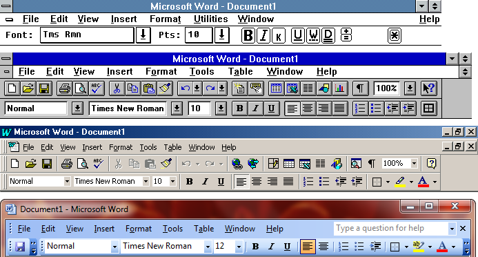
In 2007, however, Microsoft overhauled Office’s design to use what they called the ‘ribbon’ – a set of tabs with toolbars harbouring buttons of various sizes, dropdown menus, selection systems, and other interactive elements grouped by relevance. We’ll ignore that they’d already been calling it the ‘ribbon’ since the earliest releases, and that ‘ribbon’ was a common term for such toolbars in user interface design dating back to the 1980s.

I know some consider it sacrilege to say so, but I think the ribbon gets a pass. The grouping of related items together in labelled sections helps with association and understanding of function, even when just an icon is shown. The ribbon also at least displays some textual labels, which is nice for usability over everything being an icon.
Being a bit taller, the ribbon also has room to significantly flatten the hierarchy by exposing items users had to go digging for in the menu bar, so feature discoverability is much improved. Contextual tabs that only appear while performing an action that necessitates them also reduce the clutter of appearing toolbars.
In the ribbon, more commonly used items are larger and exposed more readily, unlike the equal-sized and tiny, uniform buttons, which all looked the same and were needlessly difficult for a user to click with a mouse. This let the ribbon remain consistent while making frequented items prominent, solving a problem that Microsoft had been sloppily trying to fix via ‘adaptive menus’, which would hide less-frequently used menu items (while breaking spatial memory).
For a user only requiring basic functionality, everything they need is top-level, with everything else staying largely out of their way. For a more advanced user, everything is accessible and discoverable with minimal added navigation. A power user can hold down Alt for plenty of shortcuts. I much prefer this to separate ‘simple’ and ‘advanced’ modes, which ruin tutorials or giving instructions and usually overcorrect in either direction.
Office 2007 wasn’t a perfect implementation, but by Office 2010 the ribbon had been refined: some of the extraneous borders and ‘busyness’ removed, and the ability to rearrange and customise it returned. In the versions since, it has been tweaked and improved further, and programs outside of Microsoft Office have also adopted it. The ribbon is good, and there is a reason why we’re still using it some two decades on from its introduction.


