Essay
The Death of Character in Game Console Interfaces
- 2585 words
When I powered on my Xbox Series S for the first time, there was no ceremony. A flat interface presenting a collection of rounded boxes arranged in grids and lists. It felt no different from Windows 11. An interface designed for general computing (primarily productivity and work) should not be the blueprint for a machine designed for fun. Consoles’ interfaces gave them a soul, but with it stripped they feel like little more than appliances.
The interface of the Series S is cold and clinical. We’ve abandoned environments for KPI-optimising launchers. I saw everything it had to offer within the first hour of booting up the console. Compare this to the experience with the Nintendo Wii, which, despite being released in 2006, some 14 years before the Xbox Series consoles, still keeps me coming back for the interface alone.
Wii
Even today I can burn hours clicking around the Wii, for it was not designed like a computer or a tool. It was designed like a shared media tool. Like a DVD player or set-top box. Being aimed at a general, casual audience, it took cues from familiar television sets. The Wii does not have apps or programs – it has channels. Turning the console on, you’re greeted by a large grid of them.
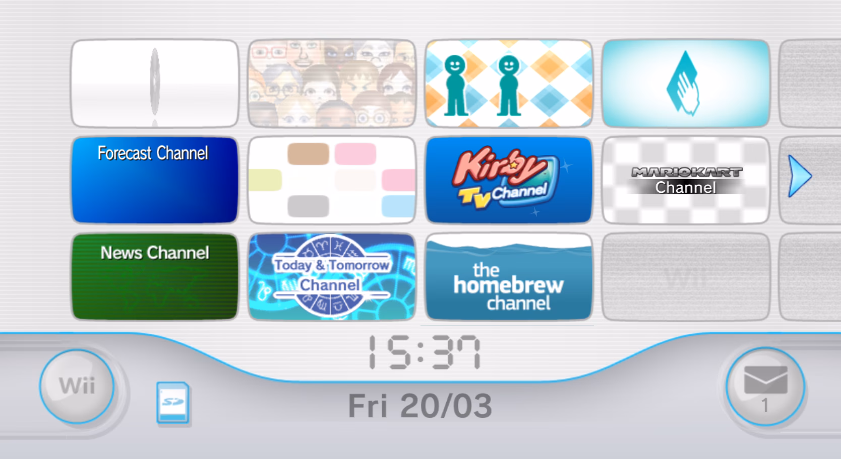
The Wii menu feels like a destination in-and-of-itself. You can boot it up and check the message board, where you get reports, messages from friends, and channels. You can mess about with Miis, then parade them about. You can bring Miis into your games, have them mingle with your friends, and load them into your Wiimote to take to a friend’s house. Each section of the interface plays its own music,1 helping orient the user and ensuring there is never a dull moment. Even without a game or an internet connection, the console feels active and alive.
The experience was well designed, and advantage was taken of it. New channels can be added to the home screen via disc or by acquiring them in the Wii Shop Channel. Users are eased into the experience with new channels only being added by user action, so it never becomes overwhelming. The design throughout the system’s menu is masterful. Constructed like a game: slowly introducing mechanics in isolation, then building upon them, then having them interact with other mechanics. There’s no explicit hand-holding, but instead the user’s intuition is trusted, and they’re prompted to explore and discover by leading them along through gradual introduction with care.
And the Wii came after the GameCube, which itself has a unique menu. An undulating glossy cube, reminiscent of the console itself. As a simple console, the GameCube didn’t justify much complexity in its interface, yet it was built with polish and kept interesting. As each setting is hovered over within the menu, a series of squares arrange themselves into the shape of a relevant icon within the glass cube. When you follow through to a configuration page, the content is represented as more floating cubes that arrange themselves as needed.
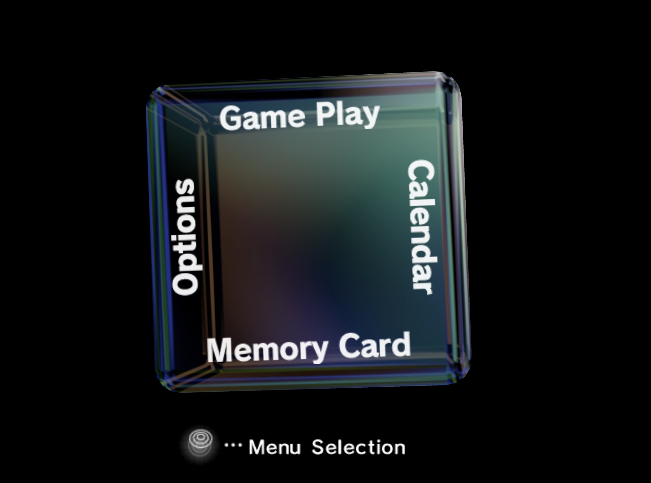
This could have just been a flat interface – it would certainly have been less effort to create – but it wouldn’t have given the GameCube its identity. The GameCube’s interface perfectly captures the mildly edgy marketing Nintendo was pursuing at the time, and the cube design language ties it into the physical squared-off design of the actual console. It also has little secrets, like the alternate startup sounds triggered by holding Z on a single controller or all four at once.
So much of the Wii’s design language and character survived into the Wii U and migrated across to the DS and its successor, the 3DS, as well. The Wii U had a plethora of social features and felt alive in a different way with its WaraWara Plaza, which was a social hub presenting other users’ Miis mingling, sometimes sharing their recent posts from Miiverse, gathering under new game releases, and engaging in other ways. However, by the time of the Nintendo Switch, nothing of the sort was to be seen. An extremely simple and very basic interface with very limited features and no background music. It’s hard not to consider it a downgrade.
PlayStation
The original PlayStation has an extremely bare-bones interface. There really isn’t much it needs to do, and system constraints kept it simple. The PlayStation 2’s interface is similarly simple but far less sparse, managing to leverage the console’s increased power to pack in details and character.
Booting the console plays a startup sequence showing a range of pillars at various heights, recalling a city. Each pillar a visual representation of a played game, with the height representing how many times it’s been launched. Managing saves has character as well, with each game having a different representation in the menu. Some representations are just flat images, but others are 3D models, and some still are interactive. The systems sounds and ambience are ethereal and liminal. It feels cold, dark, and lonely – the sort of atmosphere that is sure to freak you out slightly at night.
The PlayStation Portable (PSP) introduced a much more comprehensive UI in the XrossMediaBar (XMB), which was reused for the PlayStation 3. The PlayStation 3 is much more lively than the PlayStation 2 but didn’t do away with a defined identity. It plays the sound of an orchestra tuning when turning on, as if the console is warming up for you, and introduced great refinements to the XMB.
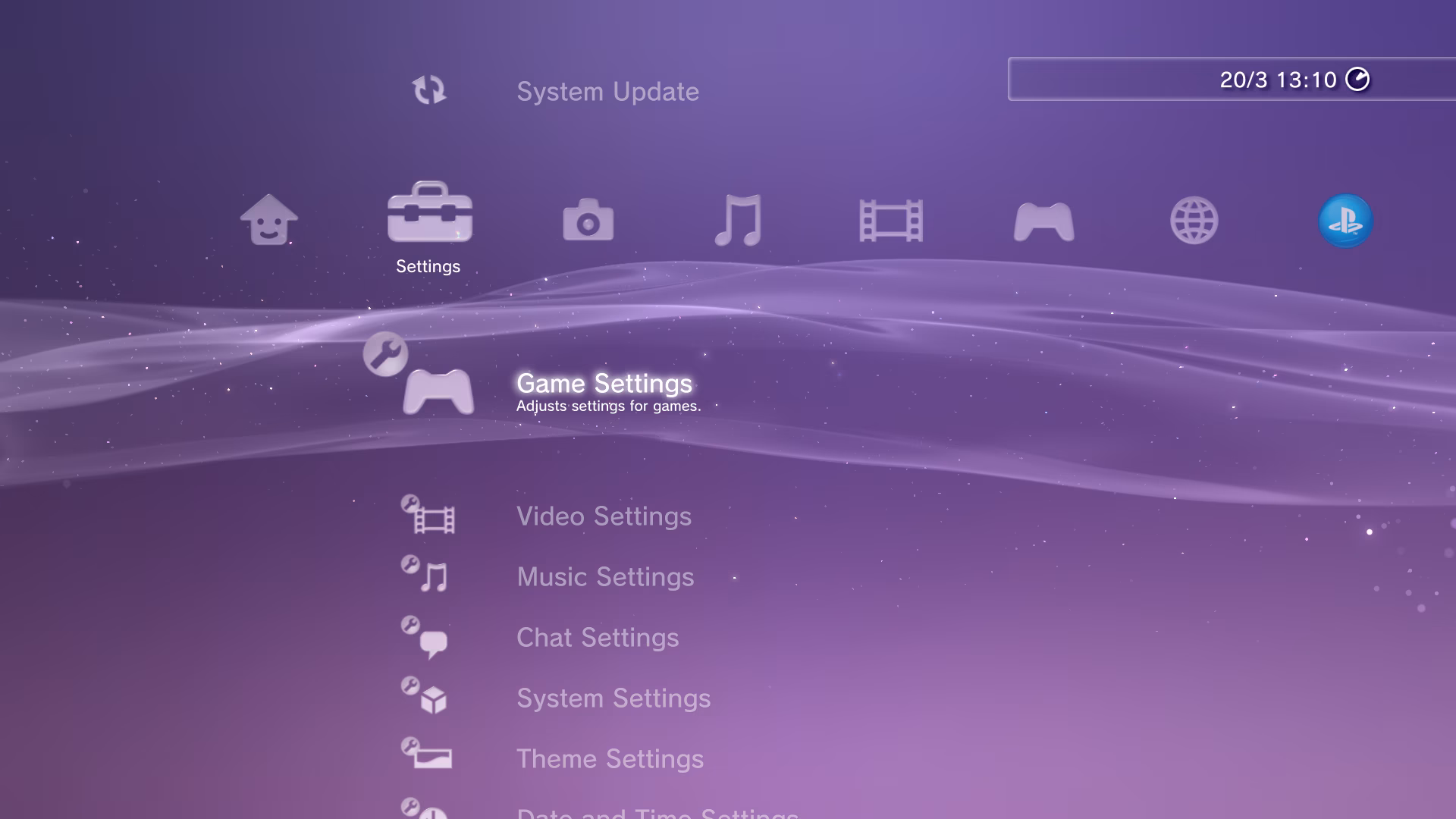
The XMB can be customised via a selection of options or by virtue of themes. Themes allow not only changing the background but also changing the icons and interface font. The default background appearance has a waving ribbon and twinkling sparkles which have a special feature of their own – the tilt of the controller influences the directions in which the sparkles move. A tiny little flourish that indicates the utmost care. The XMB is such an effective and beloved navigation system that it remains commonly replicated for use in emulator front-ends and media servers.
Following the PSP, the PlayStation Vita chose not to continue with the XMB but instead took a different approach. The menu, dubbed the ‘LiveArea’, takes visual cues from the PlayStation 3, but layout and flows from the then burgeoning touch smartphone sector. The Vita’s superior processing power allowed the interface to be much more visually detailed with movement and dynamic animations. Every application on the Vita is represented as a glossy oblate spheroid that slowly floats in place.
The console also never feels dull or static, with each application having a LiveArea screen which presents assorted actions that can be taken and containing panes that can be dynamically updated to show information and the activity of friends without needing to have the application actively open. Even just turning on the console involves peeling back the lock screen to access the main interface. Despite some of the playfulness, it doesn’t feel unpolished or juvenile but instead complementary to whatever game you’re playing.
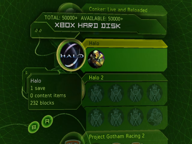
Xbox
I was late to experience the original Xbox. Yet, turning on the console to be greeted by a full real-time rendered 3D animation of a warping green blob before the camera pulls back into the Xbox logo still felt alien and magical. Landing on the system menu presents a 3D space you move through when accessing different menus. Every single action comes with clunks and chimes, making it sound substantial – like heavy machinery with hydraulics and solenoids behind the scenes. The Xbox doesn’t just have sound effects, though. It also has ambience. It hums and plays chopped, garbled sounds interspersed with heavily processed clips sourced from the Apollo mission transmissions. The original Xbox entirely feels like some extraterrestrial tool. The alien interface only complements the solid size of the console and its detailed, angular shell. It is a perfect marriage: the interface design matching the physical design, and the physical design matching the interface design.
The Xbox 360 launched with the fantastic Blades dashboard, laden with audio-tactile feedback in the form of swishes as the sections slide back and forth. However, it understandably wasn’t suited for the full social and interactive features Microsoft wished to pursue with the 360. This was addressed in 2008 with the New Xbox Experience (NXE), which brought avatars and a game marketplace. In 2010, the Kinect dashboard launched. Still layered and detailed, but simplified. The next year the Metro interface launched, which flattened everything into several screens of icons with openings for advertisements front and centre. Even at the time, the departure from the 3D style into the flatness of Metro was disliked.
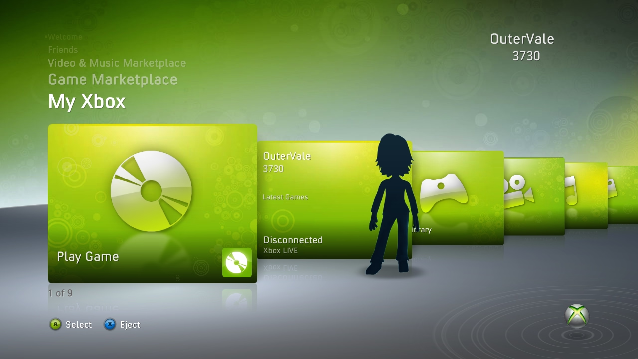
The evolution of the 360’s dashboard into the Xbox One depicts the crux of this article in stages. Each dashboard interface brought the 360 closer to ‘safe’. The Kinect dashboard still had character and a clear identity, but it was representative of a flatter, more basic direction that would come to plague game consoles in the years to come.
As Metro came and the Xbox One launched, the move towards minimal, sterile interfaces was clear. So much character was lost as part of a broader move away from skeuomorphic, textured, visually deep designs and towards flat minimalism during the 2010s. Texture and skeuomorphism surely aren’t the only way to present character in an interface, but they are certainly effective methods.
Death of Character
Somewhere following the seventh generation of consoles (Xbox 360, PS3, Wii, DS, PSP) is where things faltered. The Xbox One and PS4 of the eighth generation both launched with uninspired interfaces, though the Wii U, 3DS, and PS Vita all kept some interesting design. By the ninth generation, everything had been reduced to empty interfaces.
If the PlayStation 5 were redesigned into the Xbox Series interface, and vice versa, nobody would bat an eye. Yet, if Microsoft had redesigned the 360’s dashboard into the XMB, there would have been riots in the streets. Despite being two very different sets of consoles, with many very different styles of physical design and very defined identities, the Xbox Series consoles and their predecessor, the Xbox One, share an identical interface. The diverse world of game console interfaces that gave consoles their identity and made them unique has fallen away, leaving only bland nothingness, played safe by megacorporations.
One could argue that larger feature sets required more complex interfaces which necessitated simpler interfaces to avoid them becoming bloated and overwhelming. But do Xbox Series consoles’ interfaces really do that much more than the 360’s interface? Enough for character and spirit to be so limiting as to necessitate their disposal?
One could also say that visually expressive and technically impressive interfaces are just no longer required to showcase and move units. There was fierce competition in the early 2000s console space when many of the interface greats were made. Something all the interfaces tried to do in their design is show off some technical power and style. Take the GameCube’s glassy cube menu as an example, something that’d be nigh unachievable on the Nintendo 64. It shows a big leap in what is possible. However, improvements are much more incremental now, somewhat nulling this point.
Enshitification is a constant, and it isn’t outrageous to argue that modern consoles are designed more for the purpose of helping you buy games than play them. The cynical take is that less busyness means more places to put advertisements. Indeed, to reach the full list of my games on my Xbox Series S I must first dig through a few levels of upsells. Interfaces built for the bottom line, not the user.
You could also argue that it is the rest of the world that moved on, and consoles are only keeping up with current user interface designs to appeal to the expectations of modern audiences. However, it isn’t hard for people to understand different interfaces if they’re designed with care. The Wii was aimed at a casual audience and was understood extremely well, becoming one of the best-selling consoles of all time. Why should that be any different today?
It feels a shame to see the character sapped from interfaces. Gaming used to feel like an experience. Like jumping into another world. It still does when I play on an older console that orchestrates an experience for me. Peeling back the lockscreen on my Vita and being greeted by the home music feels eventful, as does seeing the swirling band of greens fill up the logo of my 360 during bootup. Watching a logo fade in before dropping me on a page themed the same as Windows 11 with an assortment of adverts and a small strip of some games I’ve played feels far from the precursor to excitement and much closer to getting me ready to open Word so I can format a document.
Will people still speak fondly of the interface of the current console generation in 20 years, the same way we do of the Wii, 360, PS3, and similar? I can’t imagine so.