Osseo Flesh
An experiment in fleshy typography and variable axis fonts.
I’m near certain that most people, at some point, have fantasised about wielding meat as a writing tool. Well, you needn’t wait any longer, as my Osseo Flesh typeface fulfils that dream.
While studying design, I received the brief of creating a typeface. As long as it had the entire alphabet, both upper and lowercase, anything went. I tested a few considerations, including singed paper, before settling on making a “meat font”.
For a few fleeting moments, I considered using actual meat but thought better of it and instead took it as a wonderful opportunity to test Adobe Illustrator’s 3D tools. Using some interesting texturing, I managed to concoct a fleshy, meaty typeface.

This first attempt used Lexend as a base for the sake of experimentation and viability testing. However, Lexend’s sharp edges led to my first attempts coming off feeling very rigid, which didn’t properly convey the organic structures of flesh and tissue I was aiming for.
I also couldn’t manage to get the skin feeling quite right. Even if better melded and shaped for the characters, it still felt out of place. One person suggested that hair and freckles might help ground it and fix this, though that was a step too far, so I dropped it.
Besides the stylistic issues, the 3D materials weren’t fit for much actual use given the textures were raster-based and my computer was struggling to keep up with rendering everything, so I pivoted to keeping things flat with depth able to be reintroduced with shadow if the situation calls for it.
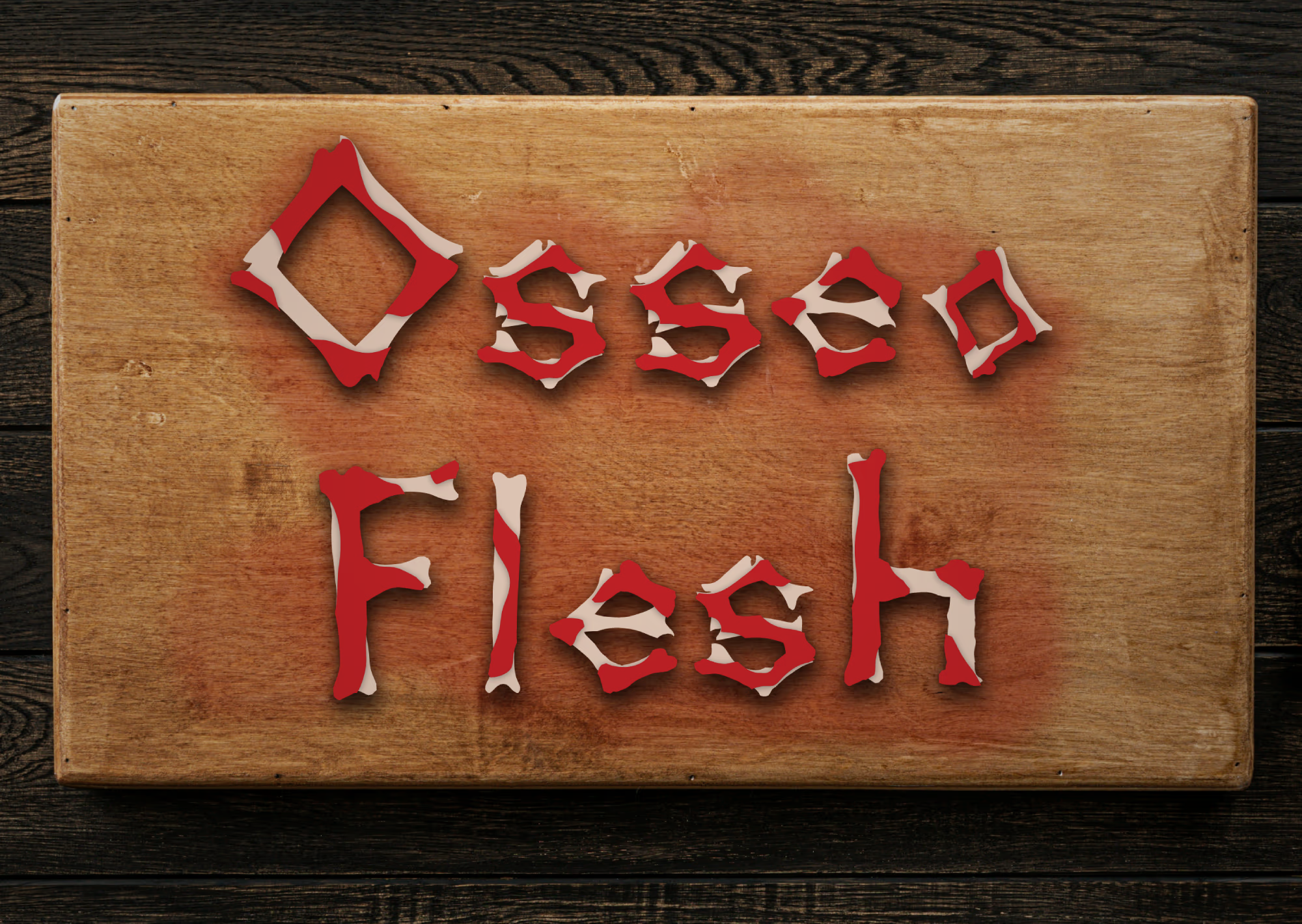
I also changed up the shape of the underlying bones to give the overall type a more unique shape that lends itself better to muscle attachment. A traditional skeletal shape was the obvious choice.
I’m currently expanding the typeface and pushing boundaries by adding a variable axis, inspired by the typeface Climate Crisis. The variable axis allows for controlling the amount of meat that covers the core bone while keeping the underlying bone unaffected by the axis for the purpose of keeping legibility at every configuration.